A visual smörgåsbord

Having discovered successful solutions to design problems in my dreams, in the shower and in someone's words, it's difficult to verbalise where 'that moment of magic' comes from. Like so much of this world, there is more unknown than known. However, a spark often comes after completely abandoning the relentless pursuit of an idea. Ç'est bizarre, non?
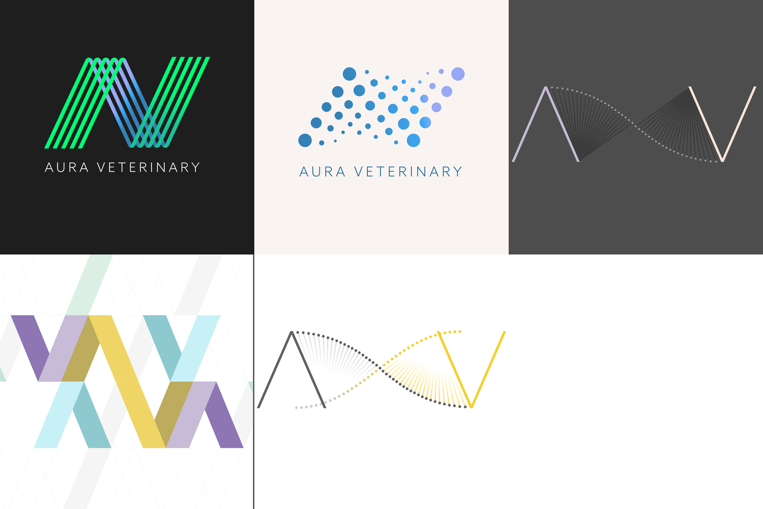
 

Concepts that sadly never saw the light of day. Aura Veterinary is a world-leading animal cancer treatment and research hospital based in Surrey. The core concepts center around DNA, science and connection.

Aura Veterinary logo concepts

This is a logomark I designed for myself, a 'J' and a 'G', my two initials reside within it. I love its uniformity and simplicity, also it's much more elegant, clever and typographically sound than that other 'G' you might have seen around the place.

James Garnham Design logo

These icons are from a fun and playful web app that reminds you of your loved ones's special celebration dates. There is an energy, happiness and vibrancy about them! The numbers are custom made for friendliness and uniformity.

Anniversary.org process steps icons

This friendly, li'l fella was created a long time ago but I still love him! It's a marque for a friendly child tutoring business. The marque must be working well for the business as they have had it for close to a decade!

Owl Education logo

A good friend of mine who wanted to start a sewing group in her local neighbourhood asked me if I would create a logo and promotional postcard for it. If you knew Lucy, you'd know it's just right! Sew good!

Red Fox Sewing Club logo

I did this a long time ago but put it on here as the institution itself is so well known. The idea of a crown being formed by imagination bubbles is still a strong concept for protecting and valuing ideas but the execution is a bit embarrassing now.

Intellectual Property Office logo

One of many rejected logos for Trustees Unlimited. Helping businesses succeed through diversity across their three tenets: trustees, boards and society is their raison d'être. I thought the tension communicated through colour on this 't' shaped marque was perfect! But no, 'another one bites the dust'.

Trustees Unlimited logo concept

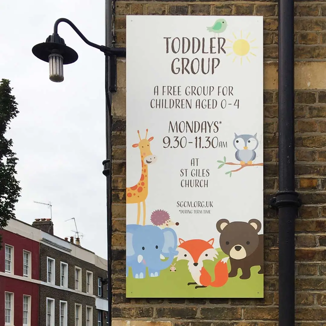
An advertising board for my local church toddler group where my wife works - a wondeful place where children can come and have great fun - and learn about Jesus - in this larger, broader space, whilst also giving parents a chance to exhale and socialise.

Toddler Group brand and poster

A social enterprise raising funds for those in need by offering 'once in a lifetime' experiences won through a lottery. I thought the concept was wonderful, it required a brand and logotype that was fun and friendly, with a smidge of exclamation given the amazing experiences!

Pinch Me Logo

Ownfone is a solution for those who want a very simple phone. This phone can be pre-programmed with the numbers and worn around the neck. These icons depict the process of choosing your phone, styling it, colouring it and then 3d printing it out at checkout!

Ownfone icons

Shown here is a UI sample featuring the logo I developed for this business whose aim is to help people remember their loved ones' special occasions. The combination of a heart and a calendar seemed a perfect fit for the job!

Anniversary.org logo

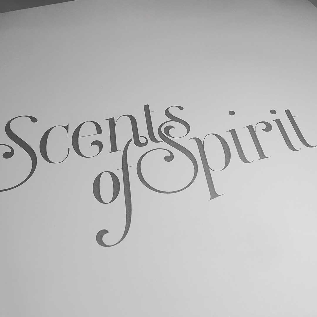
A close friend, starting a massage and aromatherapy business, asked me to help her by creating an identity and brand style for the business. It has worked wonders and my house and workplace have never smelt so good!

Scents of Spirit logo

I was so chuffed to be working with Spudulike (I knew this brand growing up). Looking to reposition themselves, and tapping into a healthier fast-food drive, the identity was about getting back to the potato's roots, and this earthy, more natural appearance fitted like a glove!

Spudulike branding and logo on bags

Top Trusted Sites is an Internet traffic business. They wanted a friendly brand and website that communicated a safe and legitimate place to be. Shown here is the logo and their themed, playful website background.

Top Trusted Sites logo

I created this chap as a face for a group of North London based vetinary practices who wanted a brand that communicated traditional British values of kindness, care and civility in the way it approached it's business and love of animals.

Jolly Fine Vets logo

An unfinished concept that never saw the light of day... Sob, sob...

Fluid logo concept

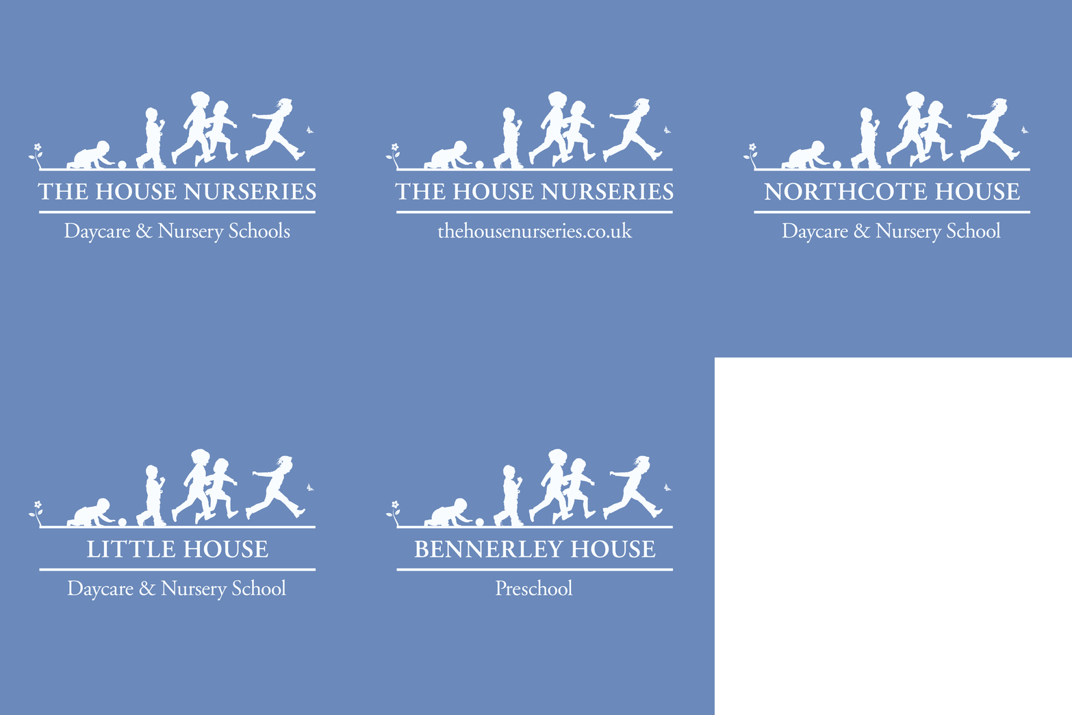
A group of family-run nurseries in West London with a true family vibe. The clients - who were lovely - liked 'French blue'. To this suite of logos I added the blue, a sense of childhood evolution and a flower at the start to nod to their original floral logo.

House Nurseries logo

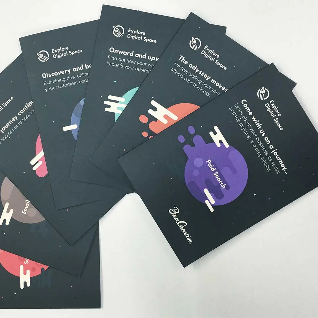
A set of flyers for a promotional campaign.

Explore Digital Space flyers

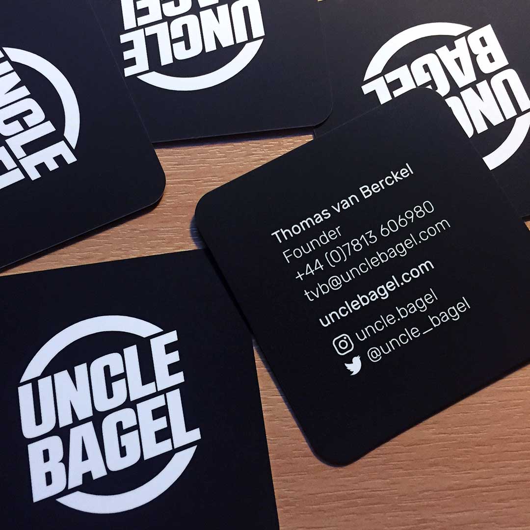
He does AMAZING bagels! I just had to help out.

Uncle Bagel logo and business cards

This logo is part of brand I produced for my local church. The colour of the cross nods to the beauty, energy and life that stained glass windows bring to old church buildings and crutially that a life of faith, is a life lived in colour.

St Giles church logo

They're icons init.

St Giles church logo

Project navigation