Clarisford
When I met the owners of this construction business their brand and website needed 'levelling up'. Their vision was to exclusively deliver services to the luxury end of the market and needed a high-end look and feel to reflect this shift in direction.

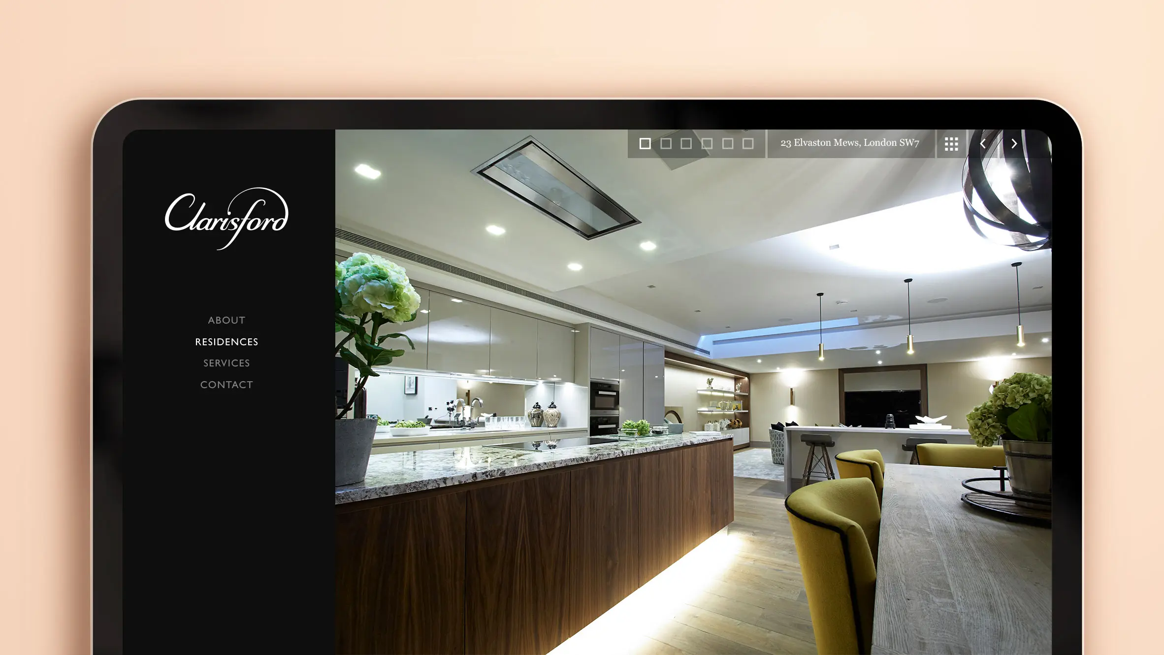
For the website I wanted the wonderful work of Clarisford to be front and center. Therefore a central consideration was, 'How to convey elegance, with the smallest amount of user interface, without a sacrifice in user experience?'.
Photography: My lovely friend, Colin Streater

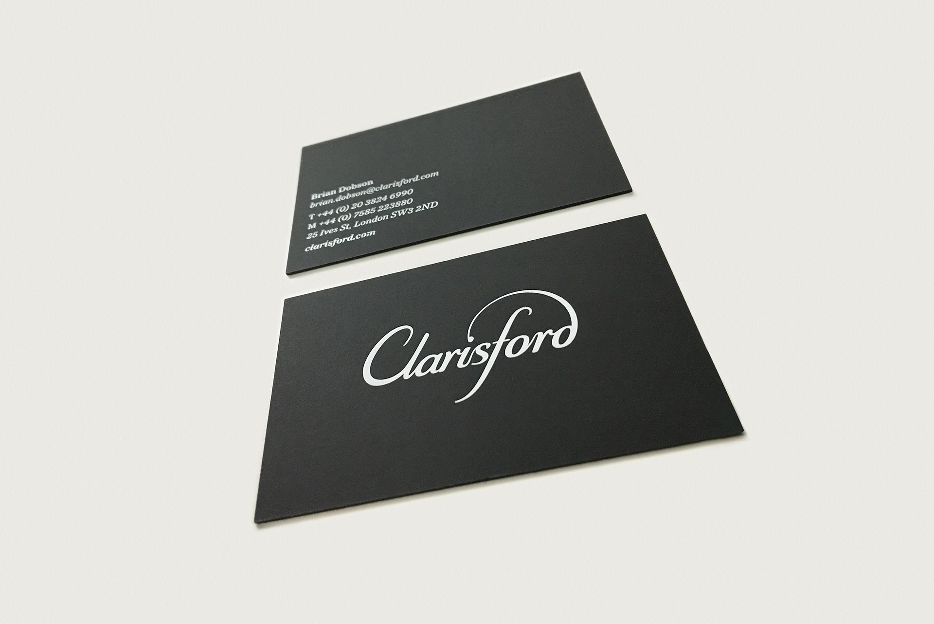
The final Clarisford logo. Their high-end finish and attention to detail is communicated through the ligature connecting the 'd' to the 'i'. More detail further down.


Residence navigation
- Image selection - Shows active image for the residence and image amount.
- Property detail - Outlines where this residence is.
- Residence selection - Access to all residences.
- Image & residence navigation - A user can cycle through every image of every residence sequentially.

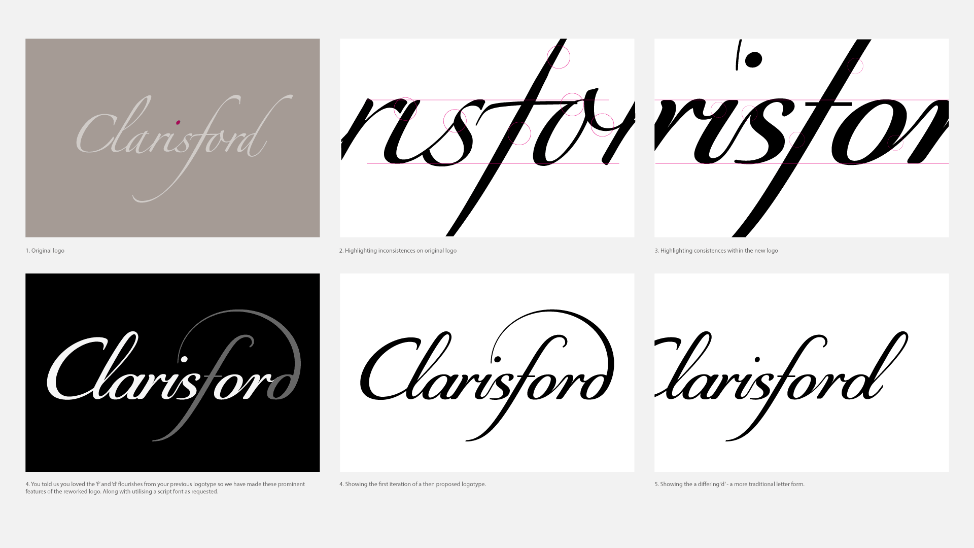
Shown here are some images from an initial client presentation, highlighting problem areas of their current logotype and benefits of the new logo. They also wanted the new logo to 'nod' to the old logo too.

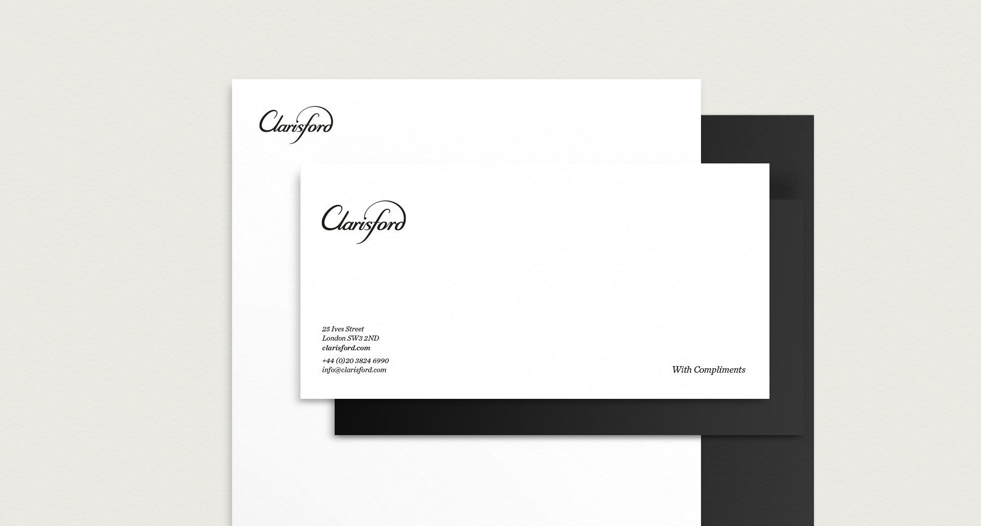
The letterhead and compliment slip embody classic elegance.
