Sorry about the mess! I'm still working on this page, I'll have it finished in a jiffy.
Awake
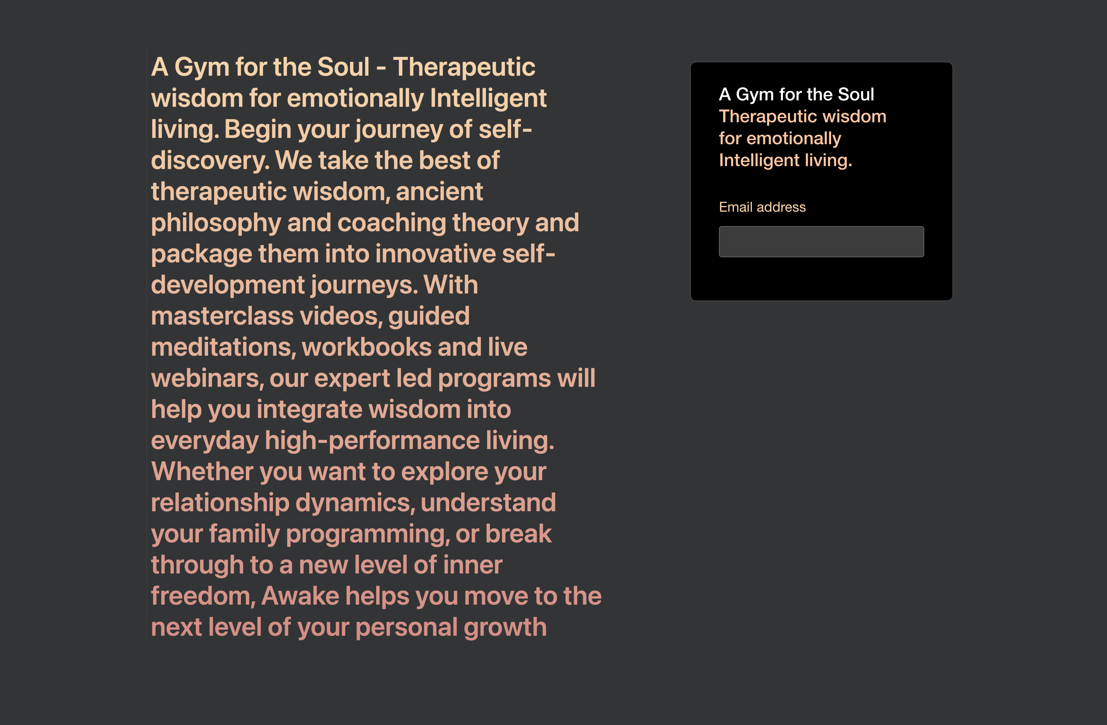
Awake is a 'Gym for the soul', a positive-spirited self-help organisation who enlightens users of their own unique potential to heal and help themselves through tailored meditations, workbooks and webinars.

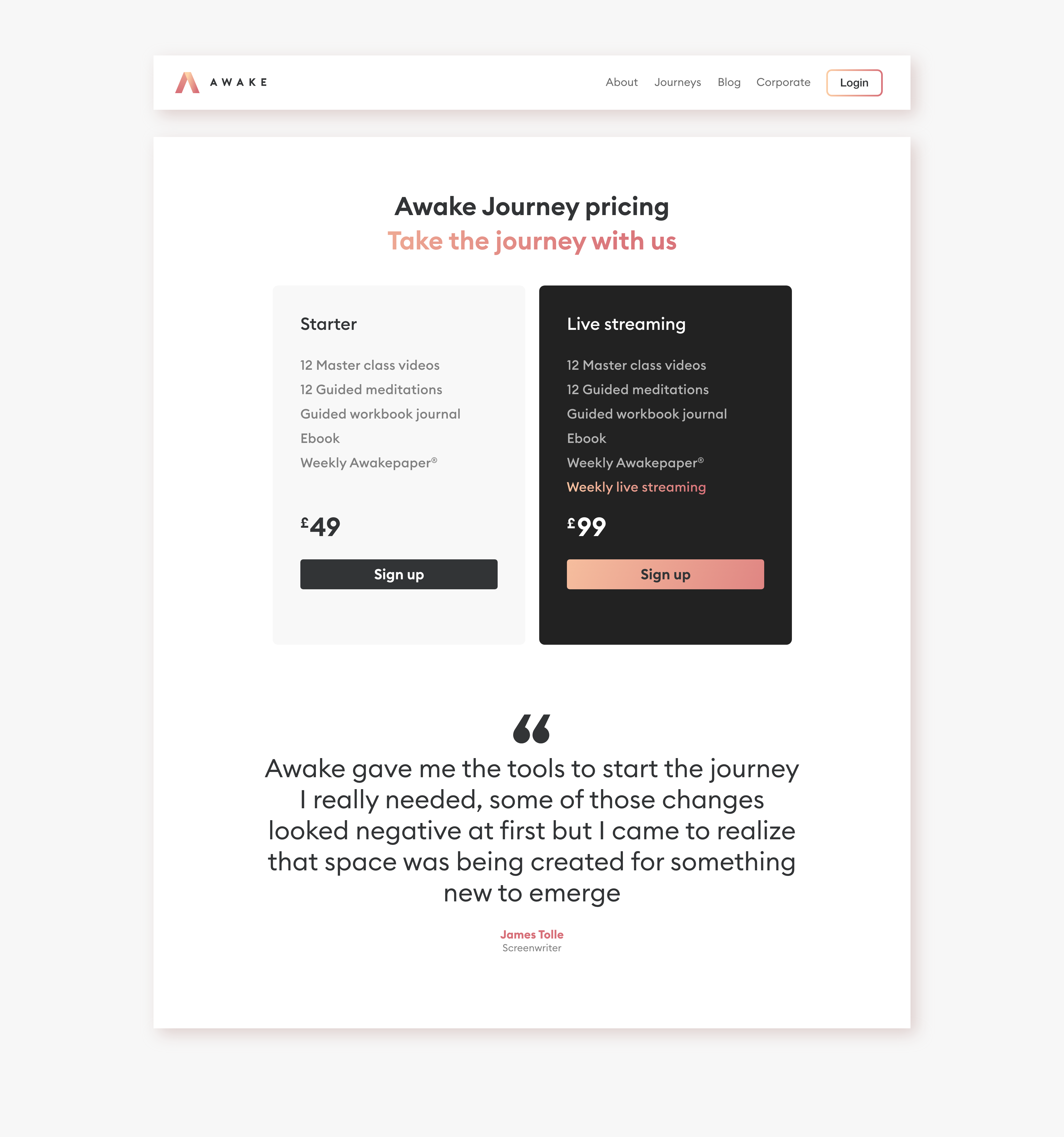
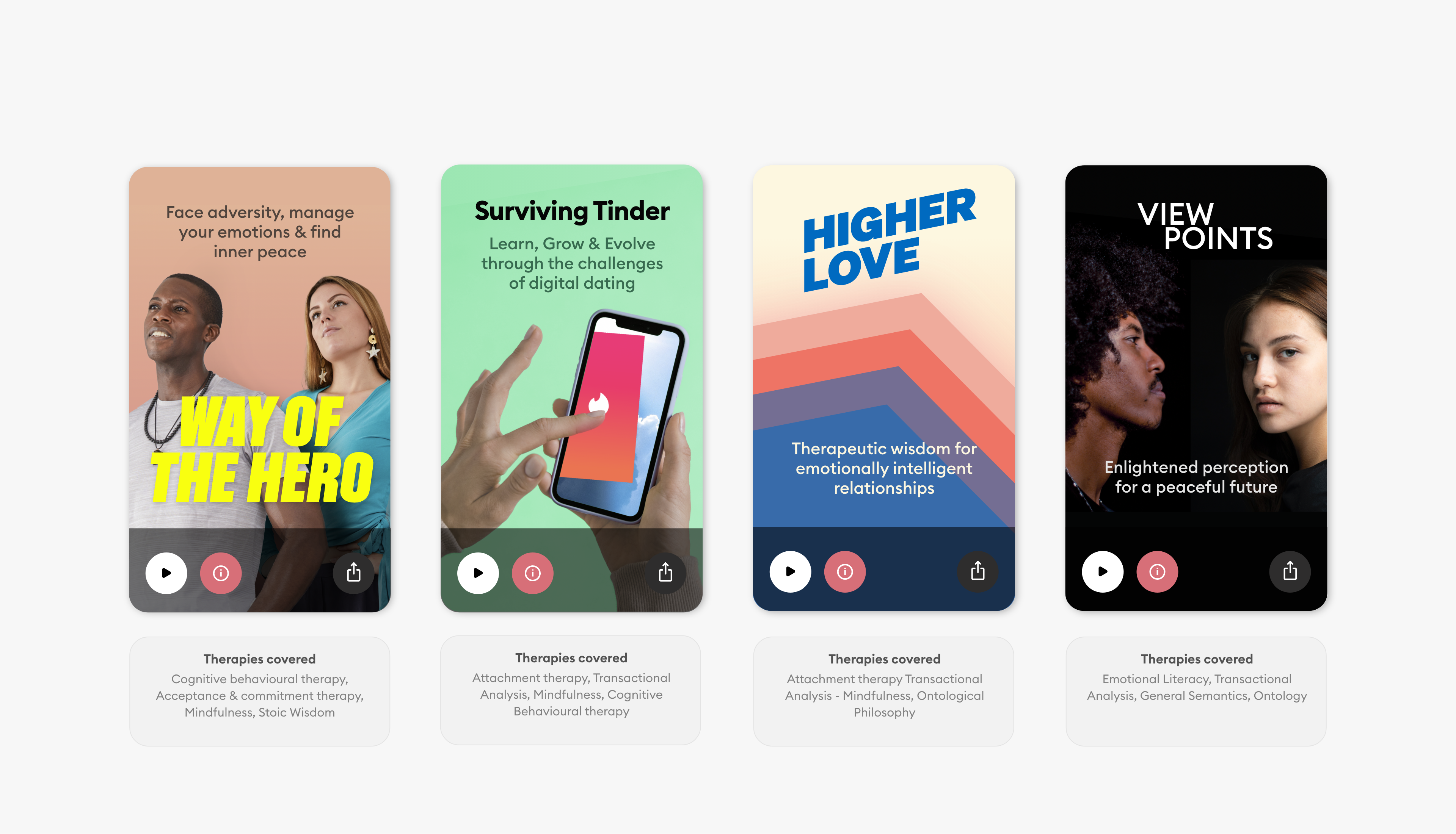
The Awake Journeys. I designed the user interface and the artwork; each of these journeys facilitate change and self-development through learning, understanding and healing.
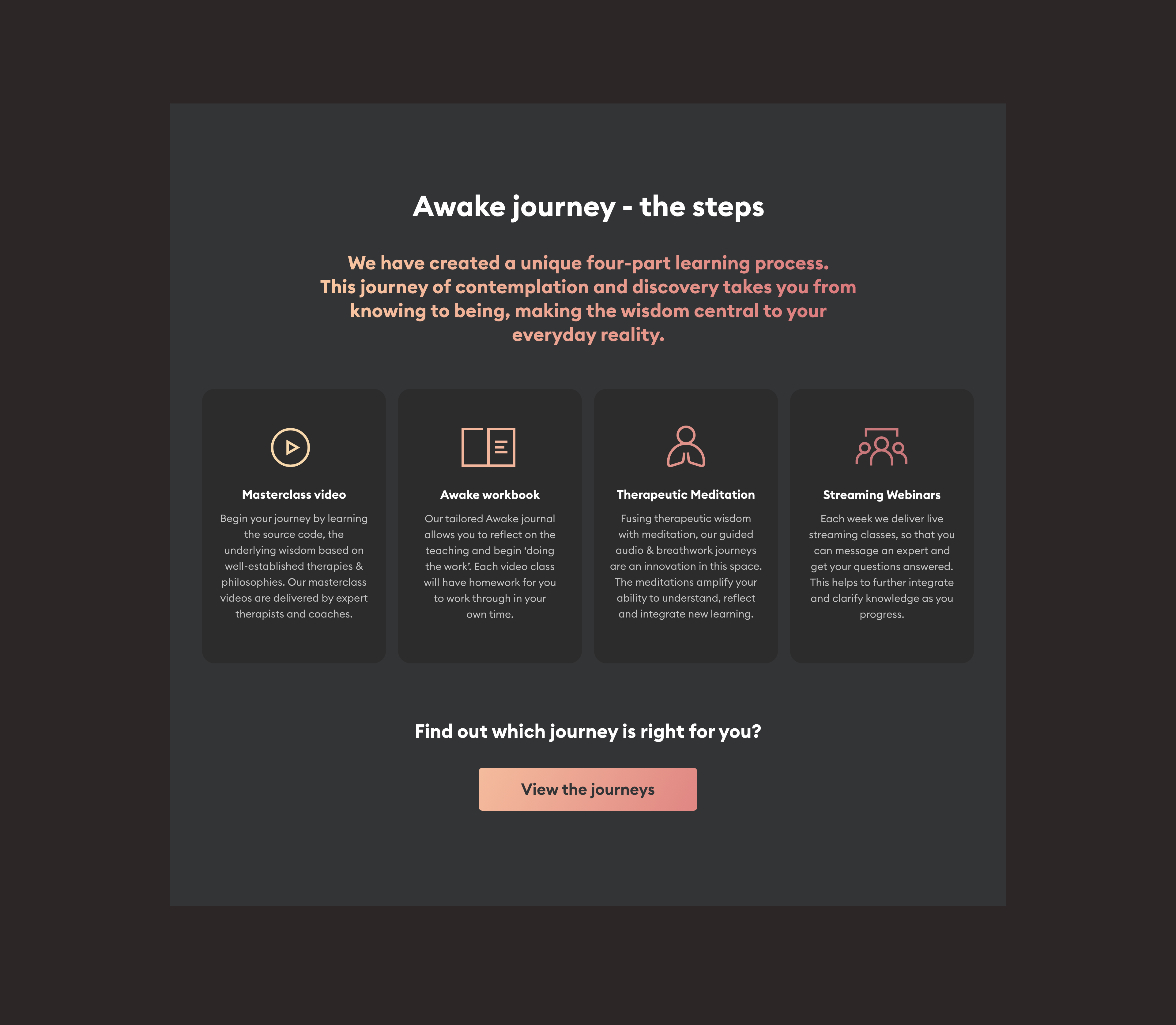
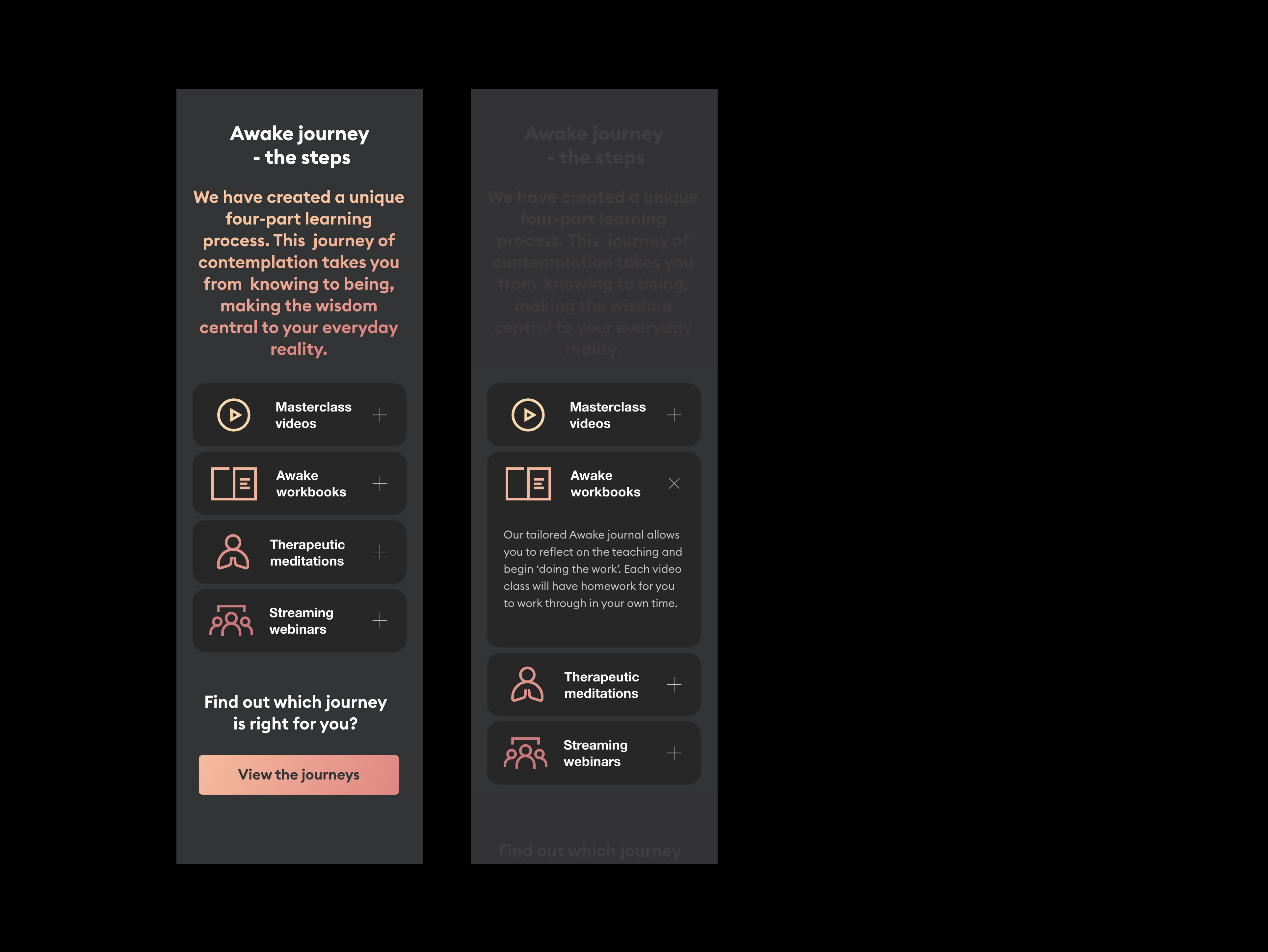
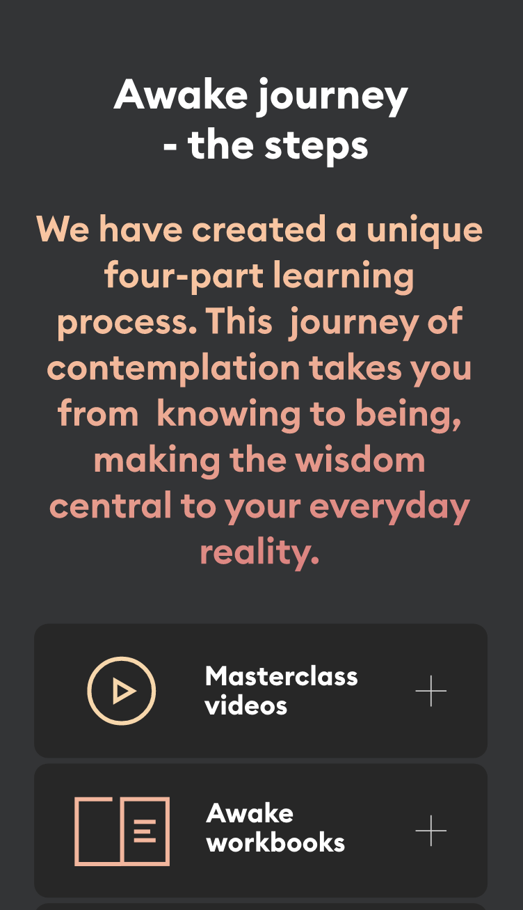
Each 'Awake Journey' consistented of these four component parts despite each journey having its own unique content and therapies. This, and all responsive web components I designed, have buttons that have gorgeous gradient animations on hover.
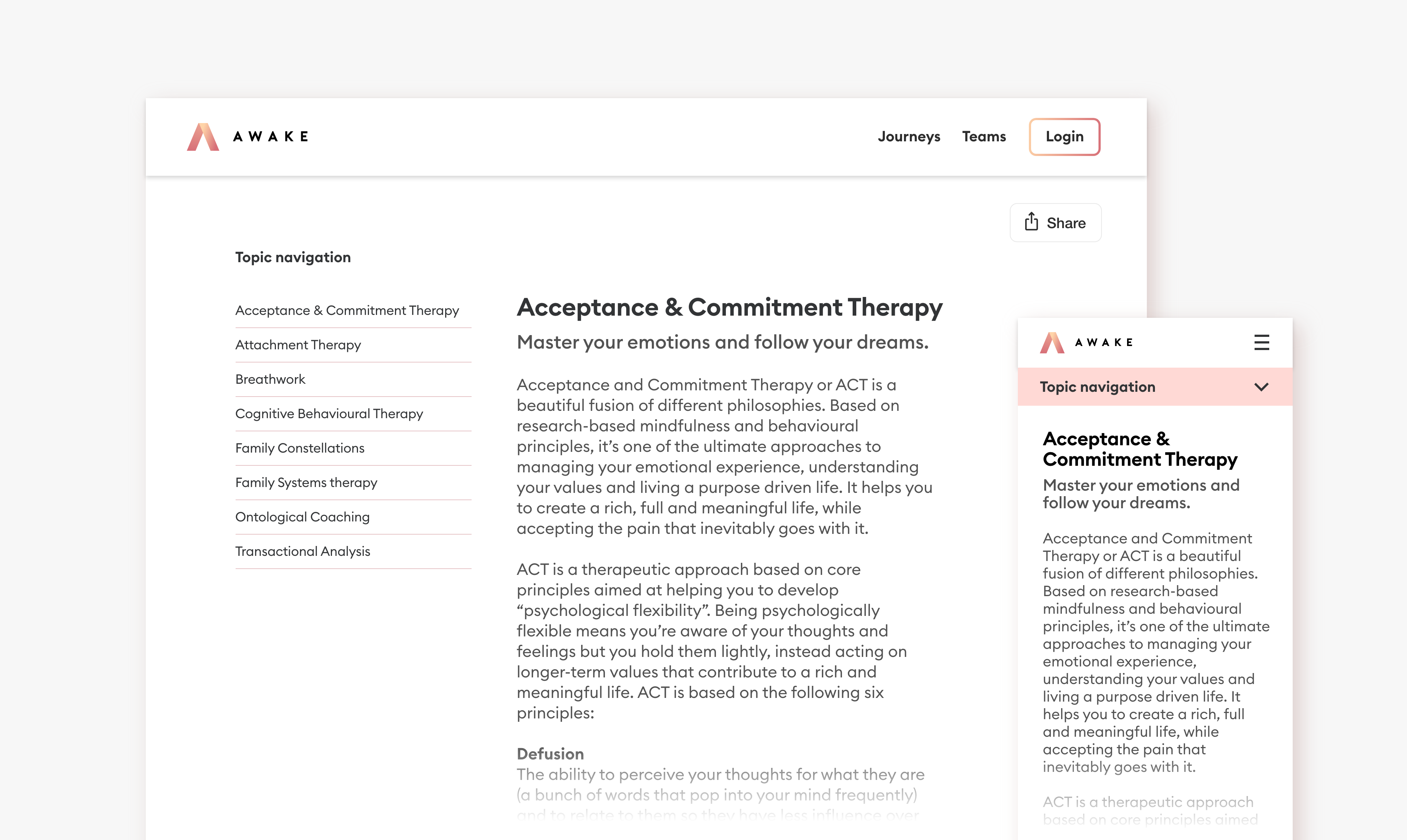
I suggested we had a glossary of terms and therapies to help people understand more about the benefits and therapies, this would also be helpful from an SEO perspective.
The glossary navigation demonstrates interaction here demonstrates navigating through various therapy types.
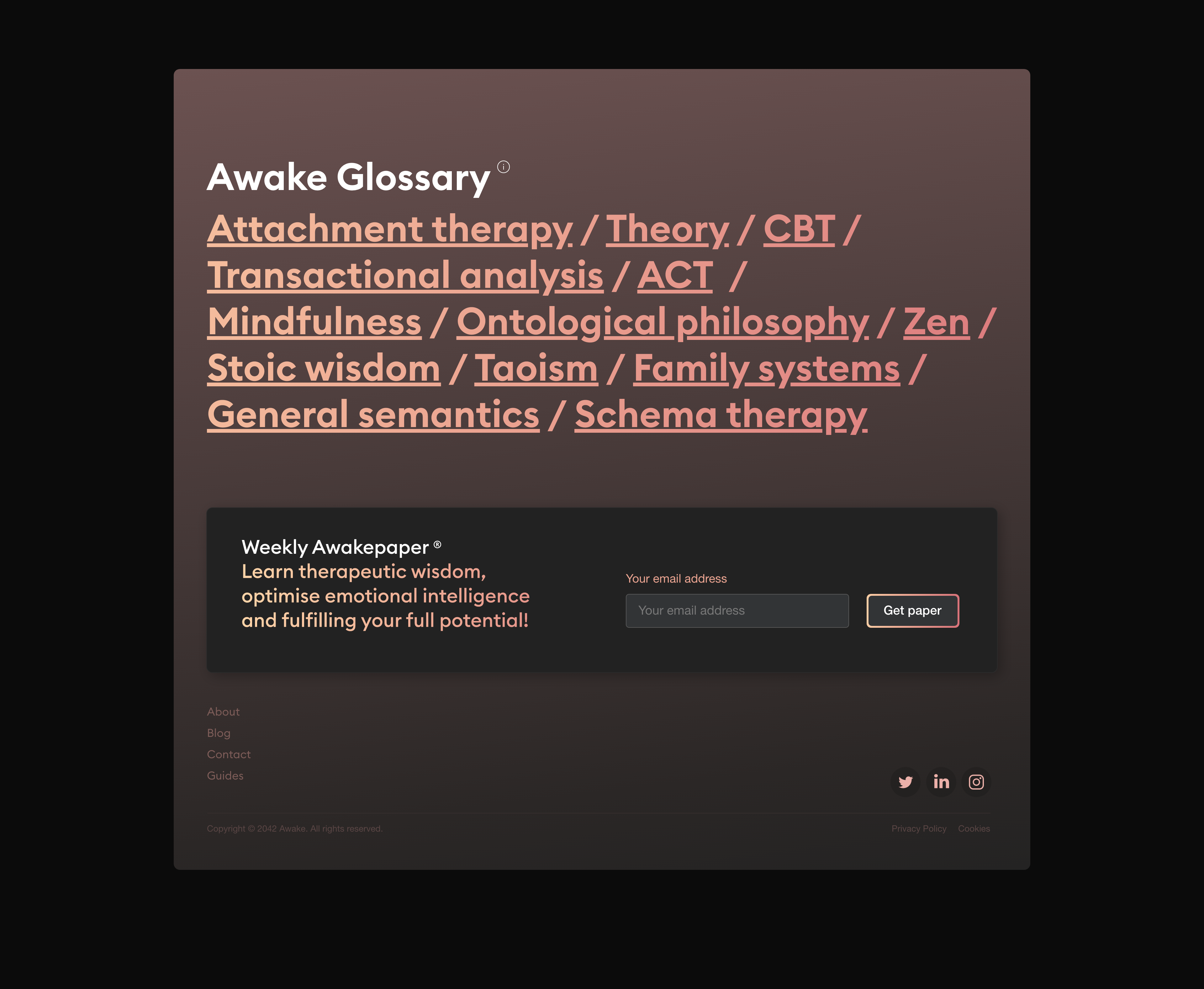
The glossary was accessed by the footer of each of the website pages, a constant helper and educator about the therapies that could help a user.
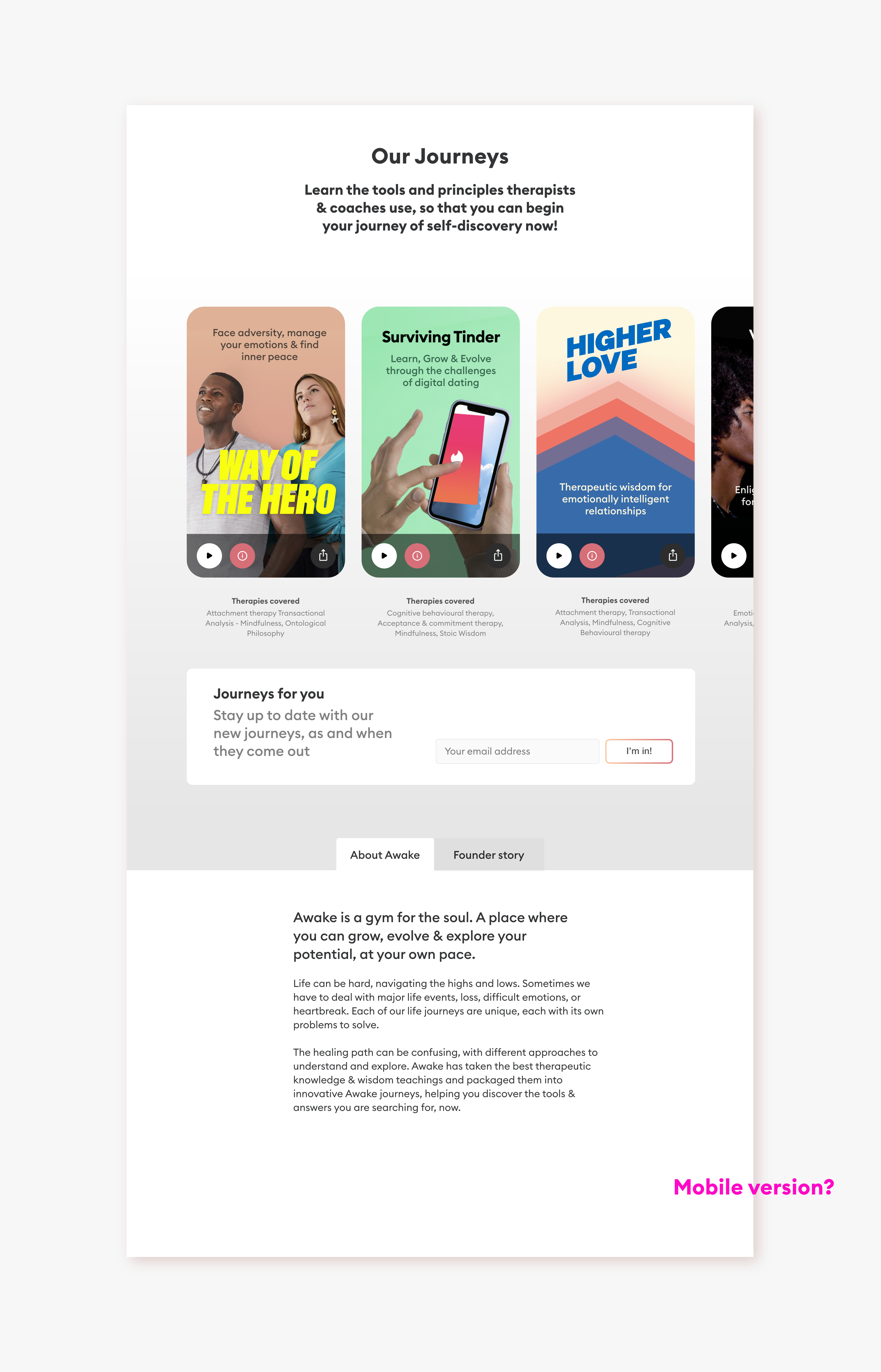
You can see here how the journey artwork integrates into the wider body of the website along with showing other required user interface elements.
A panel from the promotional website encourages users to 'find out what their savings could be' by using Score. Underneath, a couple of sign-up panel examples.
